Get Rest Mattresses
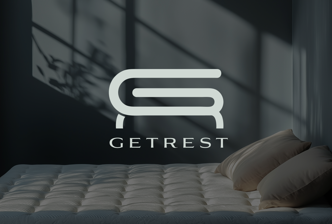
Get Rest is a luxury-focused sleep brand built around the promise of refined comfort and elevated relaxation. Designed to embody sophistication through simplicity, the brand represents high-end sleep solutions crafted for those who value both aesthetics and wellbeing. With calming tones, elegant detailing, and a serene visual personality, Get Rest positions itself as a modern luxury mattress brand that blends comfort, quality, and contemporary design seamlessly.
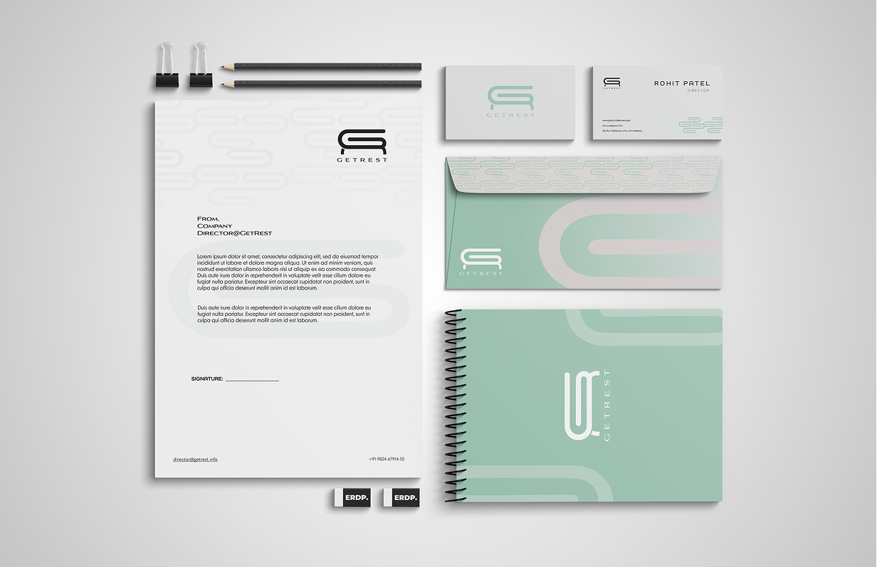
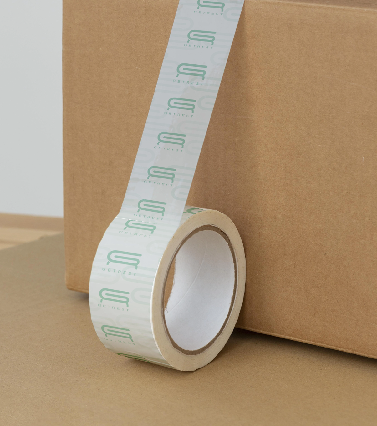
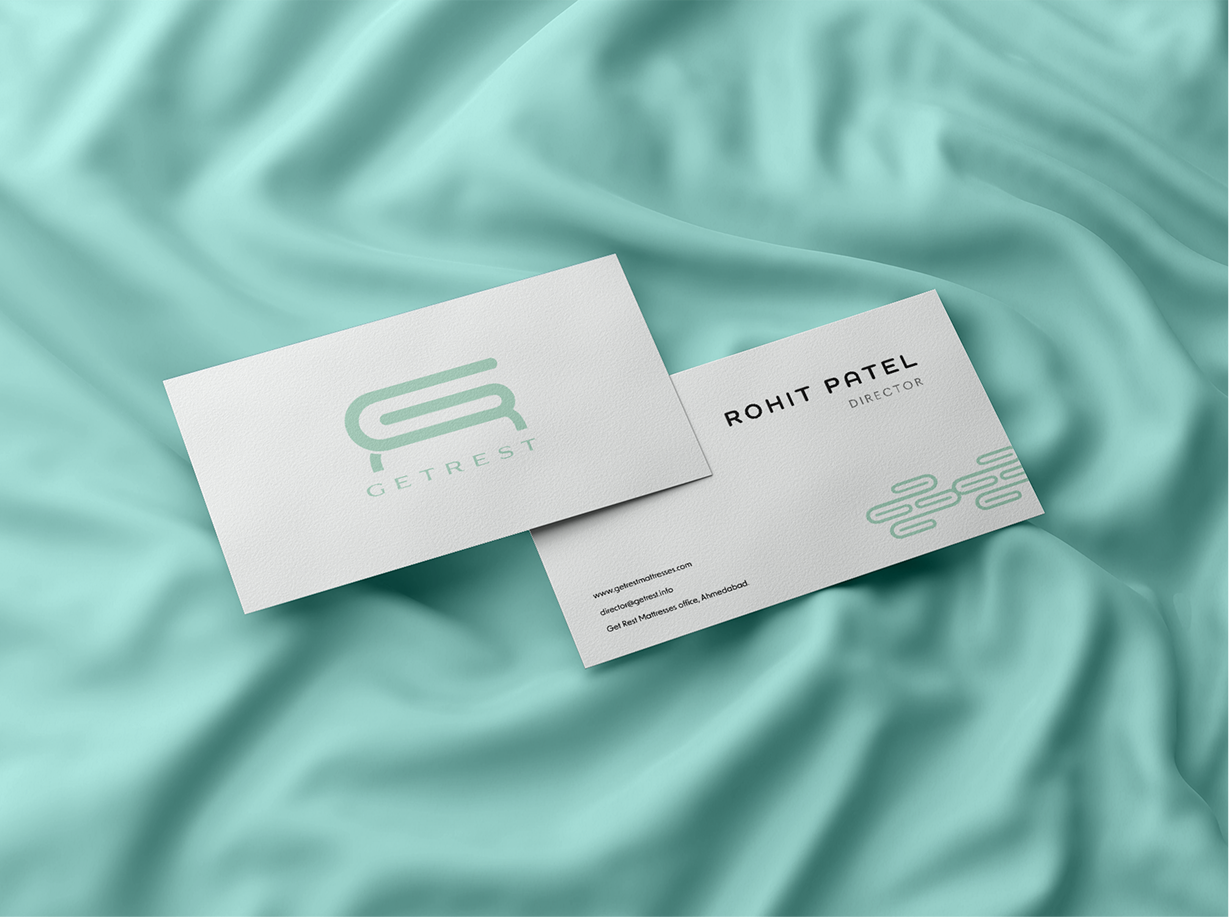
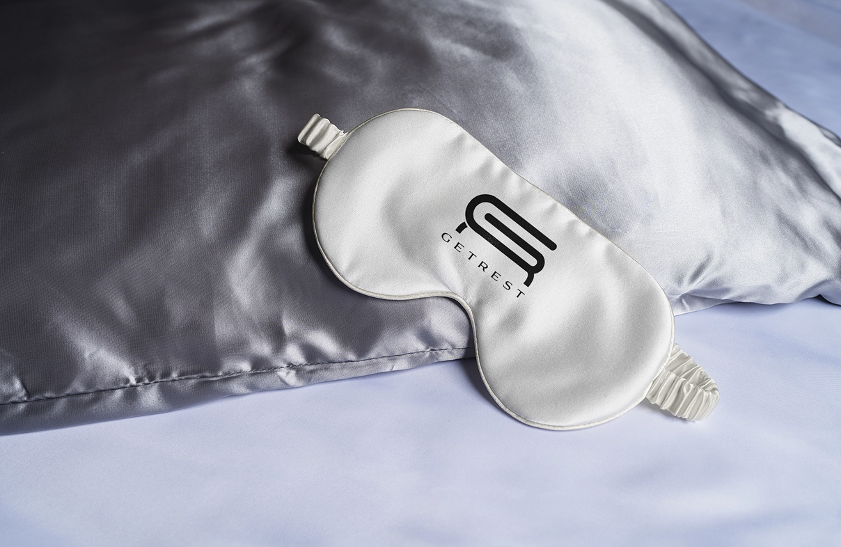
Branding & Collaterals
For Get Rest, we developed a visual identity rooted in subtle luxury and minimalist refinement. The logo and emblem were crafted to feel soft yet distinctive, while the moon-inspired visual element was extended into a quilt-like pattern system — subtly echoing the mattress surface itself. A muted, calming color palette reinforced the brand’s focus on relaxation and upscale comfort, while refined typography added clarity and sophistication. The result was a cohesive and flexible identity system that feels serene, premium, and intentionally designed to elevate the perception of sleep as a luxury experience.
No items found.

.svg)


