The Mattress Company, formerly known as Mallinath Comforts, is a redefined sleep and comfort brand built on decades of manufacturing expertise. The rebrand was initiated to align the brand with today’s evolving market — focusing on clarity, premium perception, and consumer trust.
brand architecture
brand identity
brand messaging and tone of voice
3D Product Visualization
Social media marketing
Website design & development
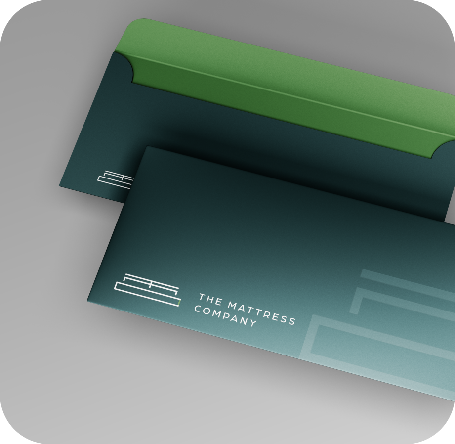
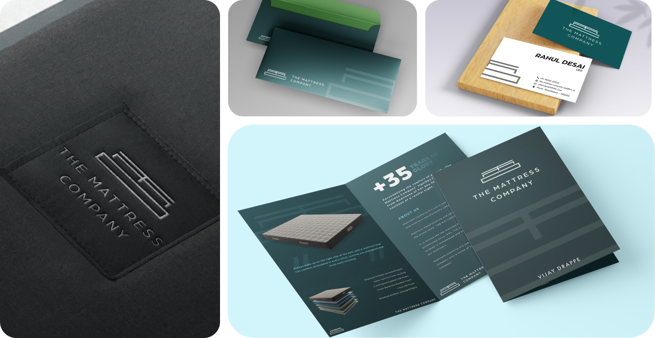
Collaterals & Print Design
bottleneck issues
Before the rebrand, The Mattress Company faced typical challenges of a growing comfort brand — strong products, but weak differentiation. While quality and manufacturing standards were solid, the brand lacked a defined emotional appeal and cohesive identity across touchpoints. Dealers and customers often perceived it as generic, resulting in low engagement, minimal recall, and inconsistent communication. Additionally, the brand name itself was conceptualized and suggested by Hypace Studios, ensuring the nomenclature aligned perfectly with market positioning, simplicity, and recall potential. This laid the foundation for a brand that was not only redefined visually but also named strategically to meet market demand and resonate with modern consumers. In short, it was a brand with potential — now given presence, purpose, and personality.
Key pain points
weak digital presence
Perceived as inferior brand by dealers.
inconsistency in brand identity
lack of emotional/corporate brand identity with dealers and distributors
Before rebranding from Mallinath Comforts to The Mattress Company, the brand suffered from low recall, inconsistent identity, and minimal dealer engagement. Despite strong product quality, it lacked modern appeal and emotional connection, the stats were as listed below.
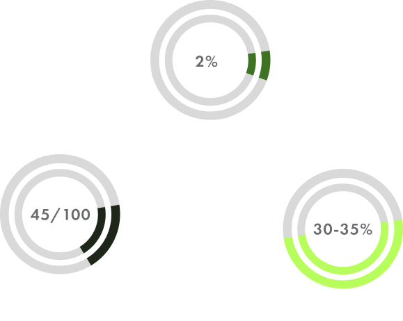
Brand Recall: 20–25% within Gujarat, dropping to below 8 % nationally.
Brand Engagement:Around 1.5%,on digital platforms and dealer communications, with limited awareness beyond product features.
Brand Equity Score: Scored around 38/100 Strong on product reliability, but weak in emotional appeal, storytelling, and visual consistency.
Breakdown
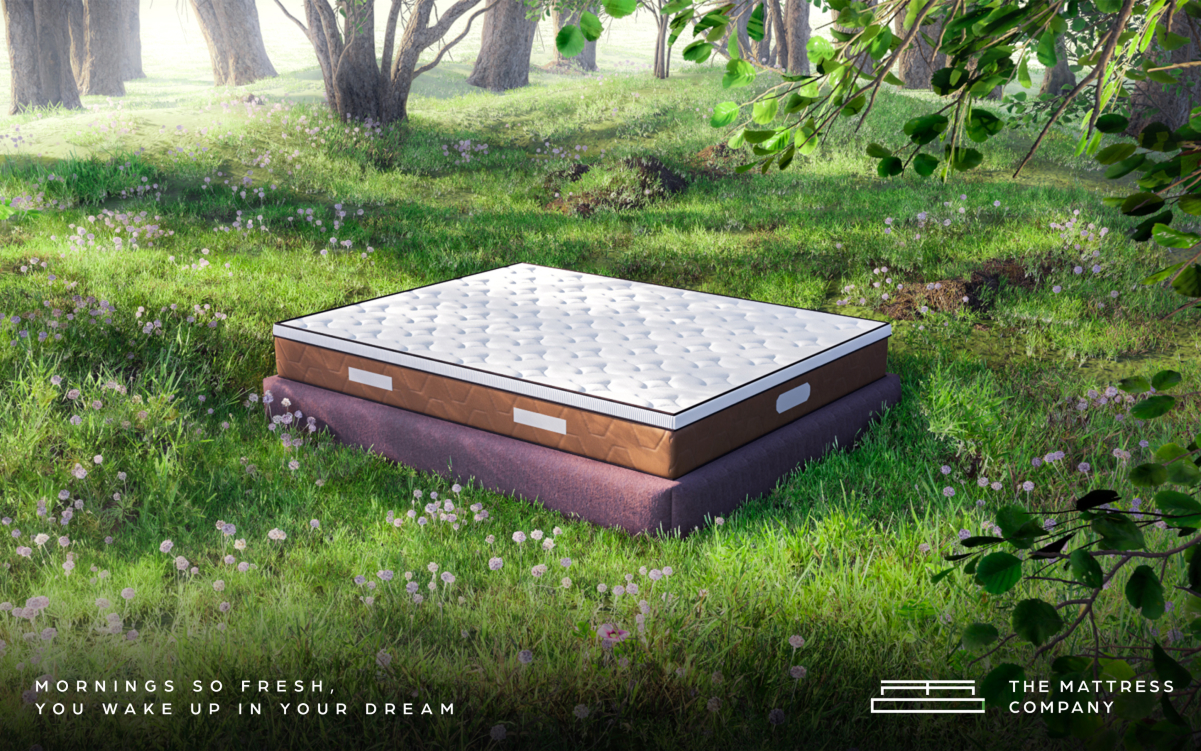
Formerly known as Mallinath Comforts, the brand had a strong manufacturing legacy but lacked the modern edge to connect with today’s audience. The old name felt dated, limiting recall and scalability in both digital and retail spaces. Our approach was to reposition the brand with a new identity — The Mattress Company — a name that’s simple, confident, and universally relatable. We built a 360° brand system that aligned the identity, tone, and storytelling across all touchpoints — from visual communication and dealer engagement to online presence.By focusing on clarity, calmness, and consistency, we helped shift perception from a traditional local manufacturer to a premium comfort brand designed for the modern market.
research
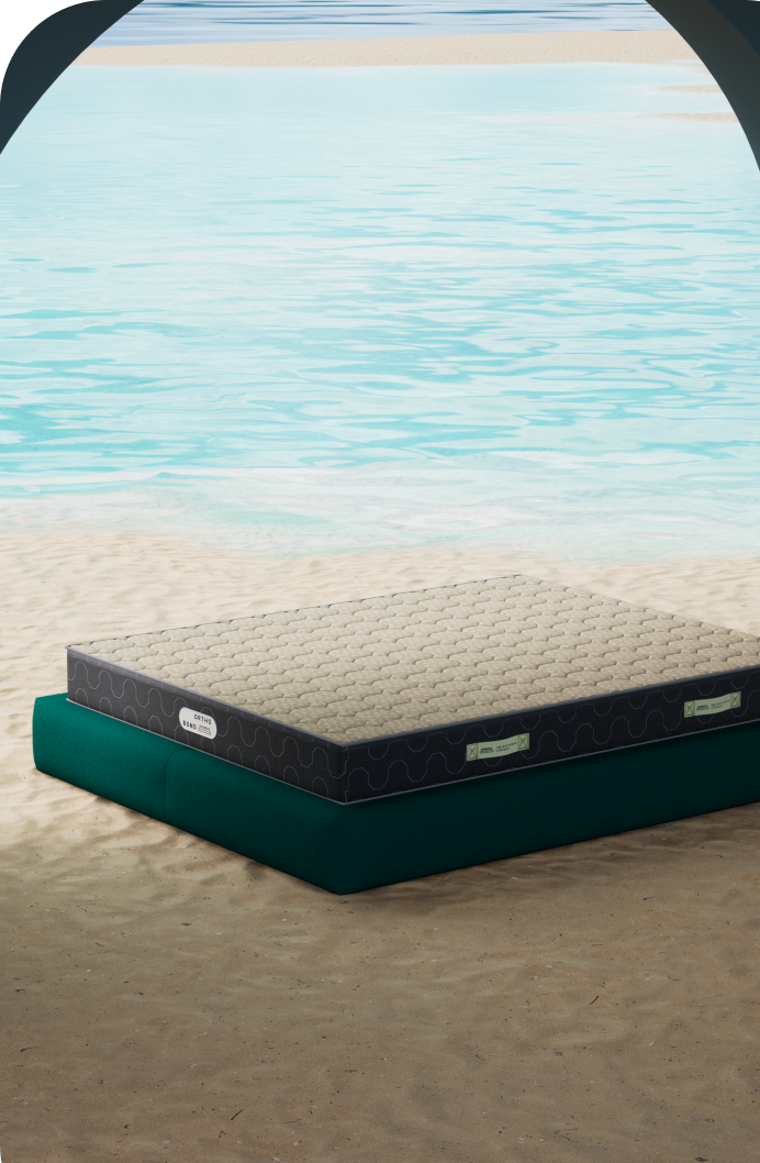
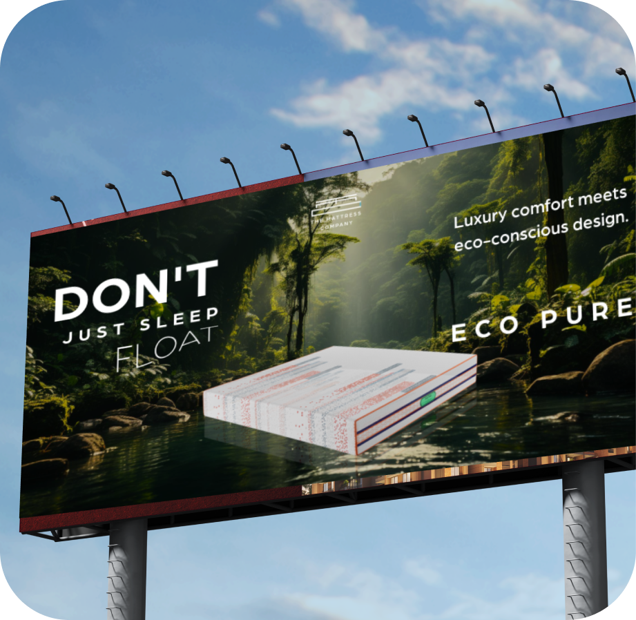
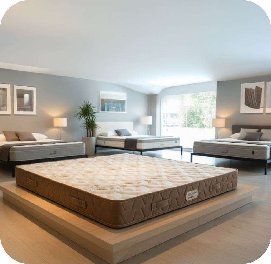
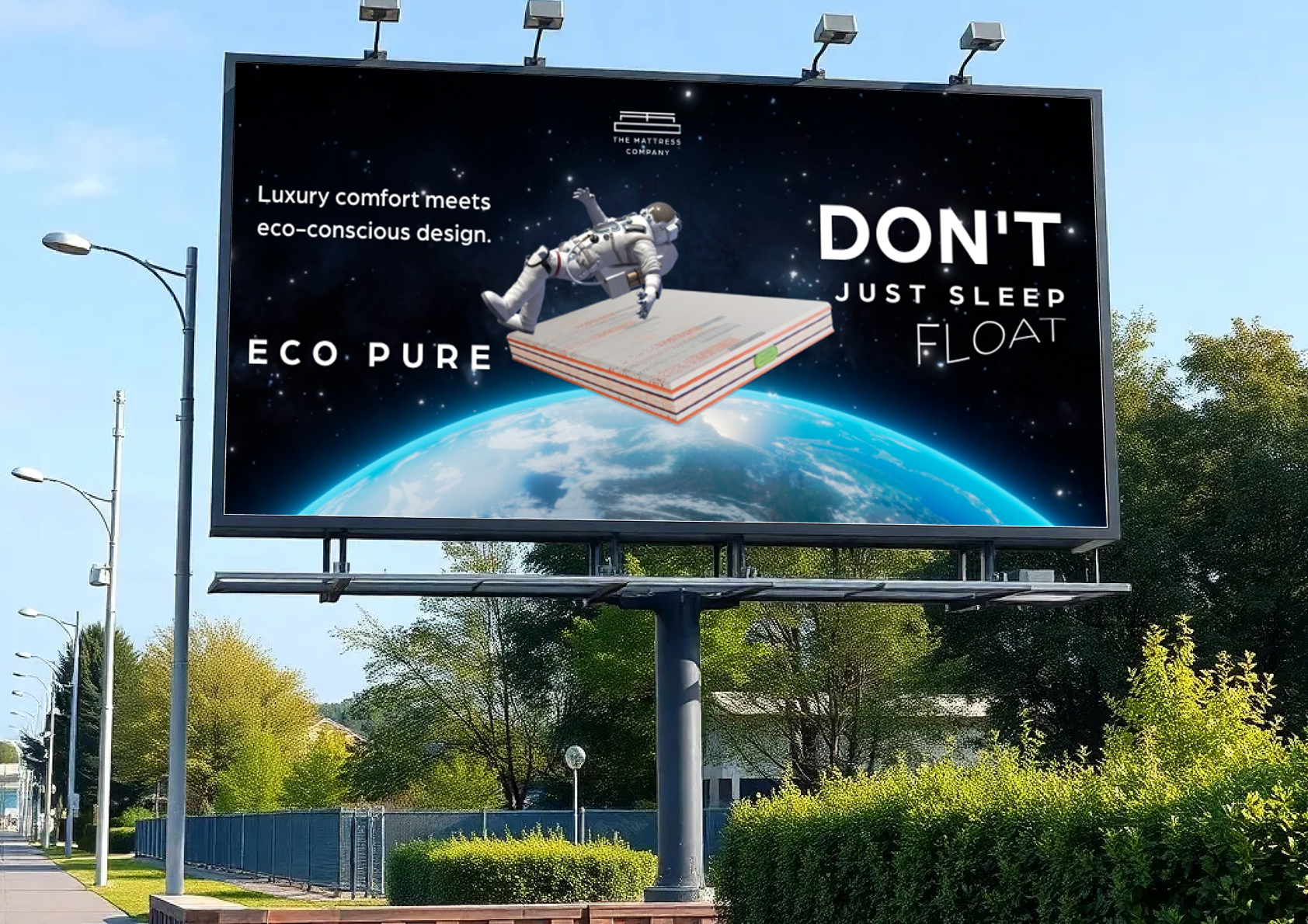
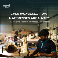
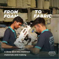
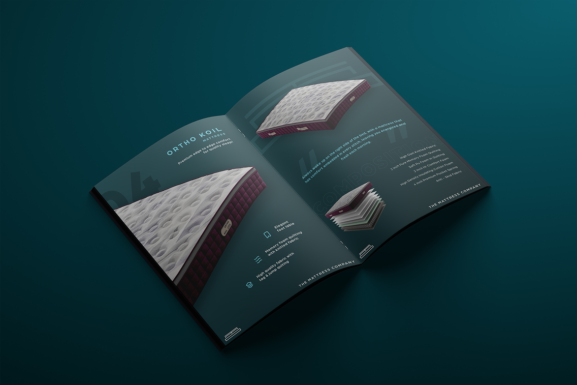
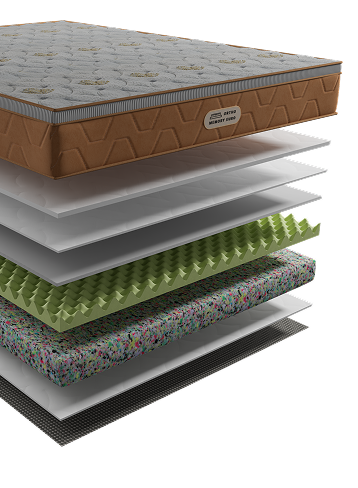
Our discovery process revealed that while the brand excelled in product quality, it lacked differentiation and emotional depth in communication. Competitor audits showed that very few brands in the segment leveraged 3D product visualization, a tool that helps customers truly experience what goes into a mattress. To elevate the brand perception and selling experience, we introduced 3D mattress designs, showcasing each layer’s technology and craftsmanship — emphasizing transparency, precision, and premium quality. This innovation not only enhanced visual storytelling but also positioned The Mattress Company alongside top industry leaders. By blending emotional branding with technological storytelling, we built a brand that doesn’t just sell mattresses — it sells an experience of engineered comfort.
Client needs (as per questionnaire)
Brand ARCHETYPE SELECTION
For The Mattress Company, the Caregiver archetype was chosen to represent its nurturing and dependable nature. As a brand centered around rest, recovery, and care, The Mattress Company needed to be perceived as empathetic, protective, and genuinely invested in customers’ well-being. This archetype guided the brand’s visual identity, messaging, and tone of voice — ensuring every interaction, from digital to retail, evokes warmth, reassurance, and trust. It positioned the brand not merely as a mattress manufacturer, but as a comfort companion that looks after its users’ health and peace of mind.

Brand feel

Brand strategy
The strategic direction focused on transforming The Mattress Company from a functional sleep brand into an emotion-driven comfort ecosystem. Our approach:Brand Architecture: Define a strong, singular identity that links product, experience, and emotion.Visual System: Develop a design language that blends structure with serenity — clean, balanced, and memorable.Messaging & Tone: Craft a voice that is calm, informative, and trustworthy, positioning the brand as a comfort expert.Consistency Across Touchpoints: Align identity, communication, and digital experience for one seamless narrative.The goal was to build a brand that doesn’t just sell mattresses — it sells better sleep, trust, and calm.
targeted points to improve
Brand tagline and messaging
Brand identity and language of design
Brand consistency throughout all touchpoints
Brand equity and emotions
brand architecture
IDENTITY CREATION
We started with a hexagon—a shape found in nature, known for its strength and balance. It symbolizes the brand's solid foundation, integrity, and multifaceted approach to growth and progress. We also introduced afluid curve, a stylized "S" that slices through the form like a current of energy.When fused together, the rigidstructure of the hexagonand themotion of the curvecreated a symbol that was instantly unique, bold, and full of momentum. It’s not just a logo, it’s a reflection of the brand's dual nature: dependable and daring, structured and spirited.

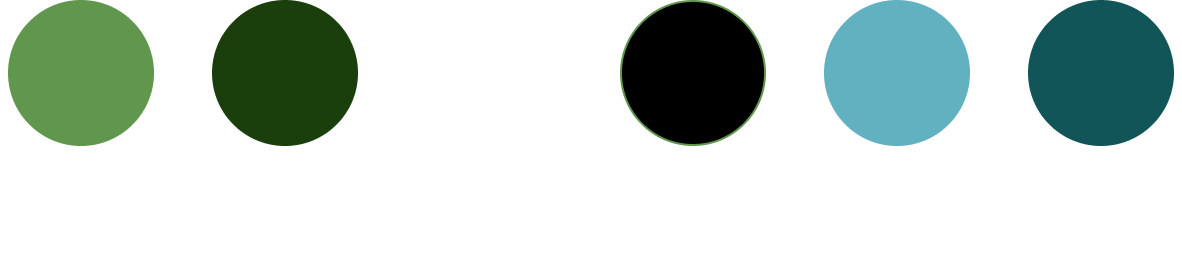
The brand’s color palette blends freshness with depth — balancing calmness, clarity, and confidence. Soft greens evoke renewal, balance, and natural comfort, while teal and blue tones introduce modernity and a sense of serenity. White represents purity and simplicity, and black grounds the palette with elegance and trust. Together, these colors create a clean, contemporary identity that reflects the brand’s promise of engineered comfort and modern sophistication.

primary font

secondary font
The type system reflects the dual nature of the brand — scientific precision and human comfort.Primary Font: Arboria — modern, geometric, and confident.Secondary Font: Futura PT Regular — clean and readable, ideal for longer text. Together, they build an identity that feels premium, balanced, and timeless, enhancing brand memorability across touchpoints.
tone of voice
The voice of The Mattress Company is gentle yet confident, mirroring the brand’s technical depth and emotional intelligence. It speaks the language of comfort — informative without being clinical, and premium without being distant — ensuring every message feels personal and reassuring.
Social media feed design
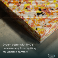
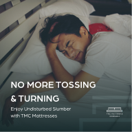
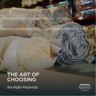
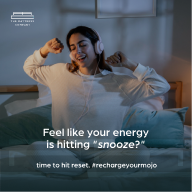
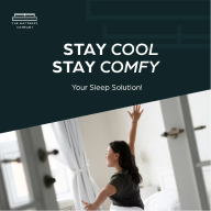
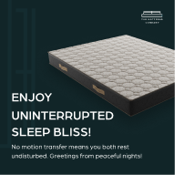
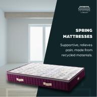
After finalizing the identity and tone, we restructured The Mattress Company’s social media presence from the ground up. Our aim was to craft a visually cohesive, educational, and aspirational feed, positioning the brand as an expert in comfort science. The content system blends product education, material transparency, and lifestyle storytelling — ensuring consistency in color palette, typography, and tone.
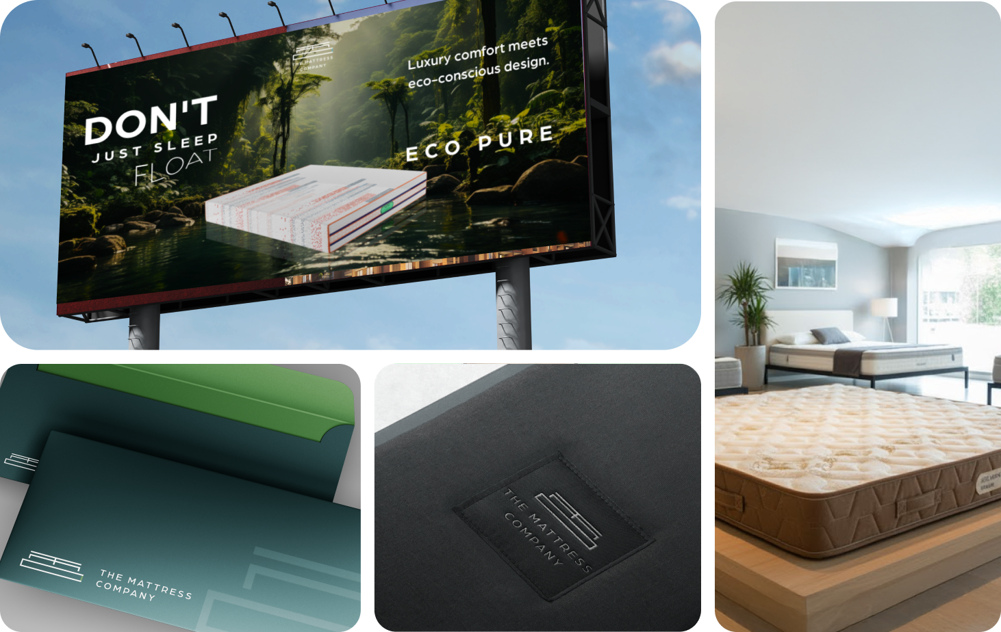
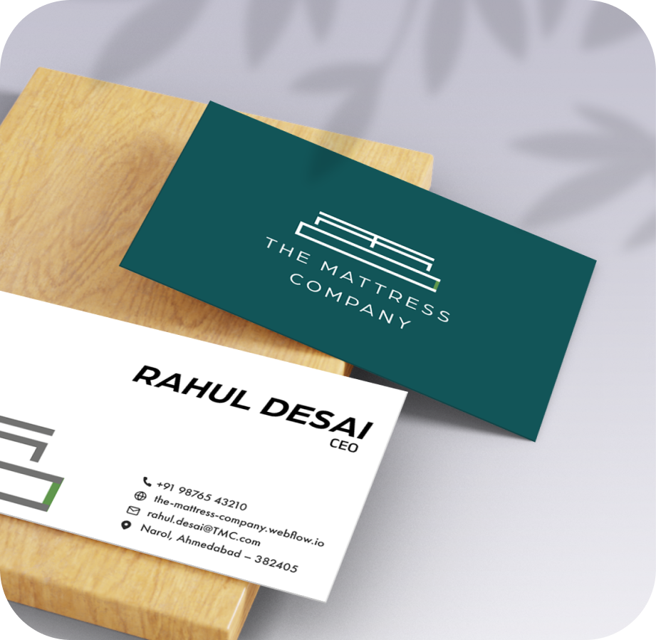
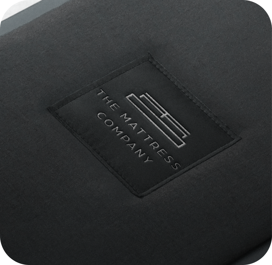
Collateral design played a crucial role in translating The Mattress Company’s refreshed identity into real-world touchpoints. From business cards and brochures to letterheads and product catalogues, every piece was designed to express calm precision and modern professionalism. Soft tones, clean typography, and minimal layouts reinforced the brand’s sense of trust and refinement, while maintaining strong consistency with the digital identity. Each element — whether in the hands of a dealer or customer — communicated comfort, reliability, and sophistication, ensuring that the brand’s experience felt cohesive across every medium.
%202.png)
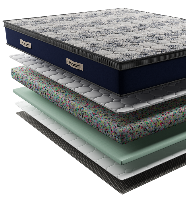
The 3D product visuals created for TMC were designed to showcase superior engineering, material quality, and craftsmanship with high visual clarity. These visuals strengthen brand positioning by communicating performance, reliability, and technical excellence. Through detailed layer breakdowns and structural representation, the 3D models help customers and channel partners gain deeper product insights, enhancing confidence, engagement, and brand loyalty.
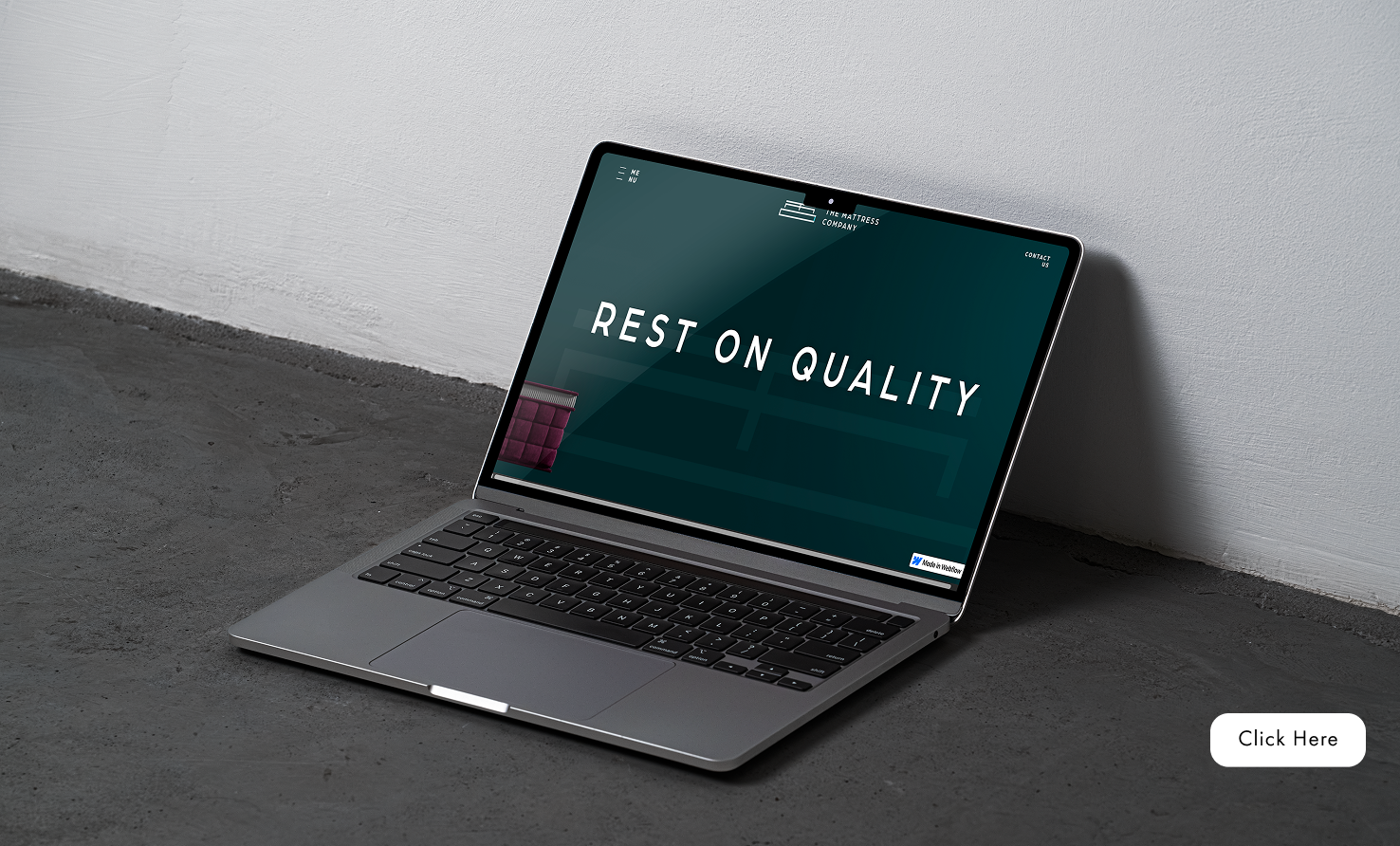
The Mattress Company website was built to express the brand’s calm, reliable, and premium personality. We focused on clean, minimalist layouts, smooth navigation, and immersive visuals such as 3D mattress layer renders and real material textures. Every element — from typography and imagery to the serene color palette — conveys trust, comfort, and innovation, ensuring a cohesive digital experience that bridges the gap between science and sleep.
Breakdown
Following the rebrand, The Mattress Company achieved a substantial uplift in both digital engagement and retail perception.95% increase in website traffic and social media engagement.3× growth in dealer confidence and customer recall within six months.Stronger emotional connection through consistent tone, visuals, and storytelling. The brand is now perceived as an approachable, credible, and aspirational leader in the mattress segment.

Increase in social media engagement

Growth in dealer and customer loyalty
“Hypace Studios executed a complete transformation for us — from redefining our identity to creating a seamless online and offline brand experience. The new visual language, product storytelling, and website design perfectly capture the essence of The Mattress Company — calm, refined, and trustworthy. Their 360° approach helped us align our communication, design, and customer touchpoints, truly elevating how our brand is perceived in the market.”
the mattress company

2313 W Sam Houston Pkwy N, Houston, TX 77043, USA
F-90/10, Pocket F, Okhla Phase I, Okhla Industrial Estate, New Delhi, Delhi 110020
Here's where you can find us :
+91 97378 33335
503, Shilp Zaveri, Shyamal Cross Rd, near Iconic Shyamal, Ahmedabad, Gujarat 380015


.svg)
Social Media Revamp