Sachi Group is a leading name in Gujarat’s steel and construction materials sector, comprising Sachi Steel and Sachi Precast. With a strong legacy of quality and reliability, the Group caters to builders, developers, and infrastructure projects across India. Despite their robust foundation, the brands lacked a unified identity, cohesive communication, and recall value in a rapidly evolving market.
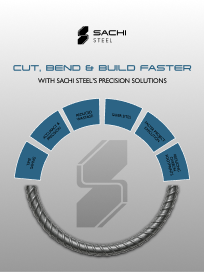
brand research
brand identity design
brand messaging and tone of voice
Social media marketing
Website Design
bottleneck issues
Before our collaboration, Sachi Group — comprising Sachi Steel and Sachi Precast — faced challenges typical of a growing industrial brand. Despite a strong distribution and product base, the brands lacked recall value, clarity of connection under one group identity, and consistency across communication channels.
Key pain points
Weak or inconsistent digital presence
Absence of emotional or cultural connect in communication
Lack of unified brand architecture between Sachi Steel & Sachi Precast
Limited offline marketing and inconsistent visual identity
Minimal brand recall and recognition in new markets
As per the bottlenecks faced by the brand, before our collaboration. These were the stats that they had before the collaboration. Low engagement, lower emotional/cultural value and inconsistency are to name a few.
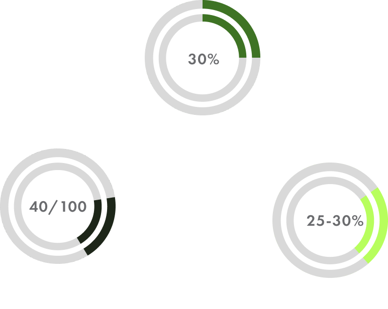
Brand Recall: 30% within Gujarat, dropping to under 10% in other states.
Brand Engagement:Digital and offline engagement rates below 2%, with limited awareness of shared group identity.
Brand Equity Score: Moderate—strong operational reputation, but weak brand storytelling and visibility.
Breakdown
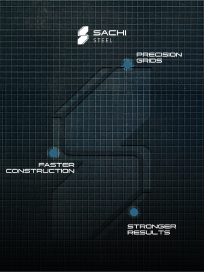
Our goal was to reposition Sachi Group as a modern, reliable, and forward-thinking industrial brand. We streamlined their brand architecture, ensuring Sachi Steel and Sachi Precast communicated under one unified identity. Through consistent design systems, tone of voice, and cross-platform communication, we strengthened brand equity across digital and offline touchpoints. Campaigns, websites, and storytelling-driven content positioned Sachi Group as a trusted partner in building tomorrow’s infrastructure.
research
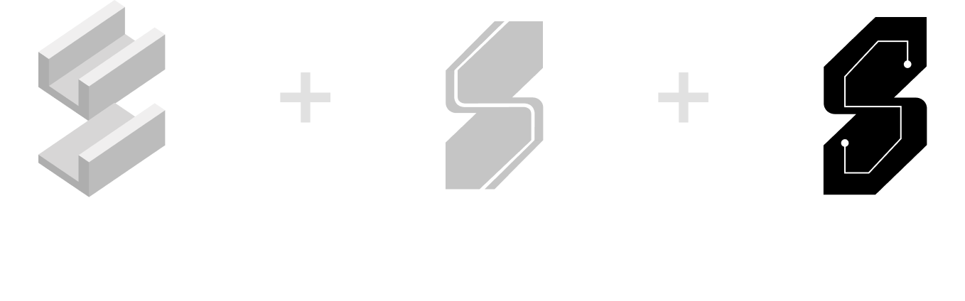
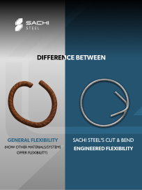
hrough competitor analysis and brand discovery workshops, we identified that Sachi Steel needed an identity that reflected engineering precision, reliability, and structural strength. The earlier design language lacked authority and emotion — it communicated product utility but not brand character. The new identity was built to look corporate yet grounded, balancing industrial sharpness with approachability. We defined the brand voice to be articulate, professional, and assertive, while maintaining an undertone of trust. The visual design, from the metallic “S” emblem to typography, symbolizes strength refined by care — aligning perfectly with Sachi’s philosophy and product excellence.
Client needs (as per questionnaire)
Brand ARCHETYPE SELECTION
After understanding the group’s values, industry positioning, and long-term vision, we selected the Creator archetype — symbolising precision, craftsmanship, reliability, and innovation. This archetype aligns with Sachi Group’s role in shaping infrastructure and delivering dependable steel & precast solutions. It guided our creative direction, ensuring the brand tone remained skilled, purposeful, and trustworthy across every touchpoint.
Brand feel

Brand strategy
Our strategy aimed to unify Sachi Group’s visual and verbal identity, positioning it as a credible, modern, and trustworthy name in steel and precast innovation. To strengthen brand equity, we focused on:Establishing a clear brand architecture connecting Sachi Steel and Sachi Precast.Building a consistent design language across all platforms.Infusing emotion and trust into communication and storytelling.
targeted points to improve
Brand tagline and messaging
Brand identity and language of design
Brand consistency throughout all touchpoints
Brand equity and emotions
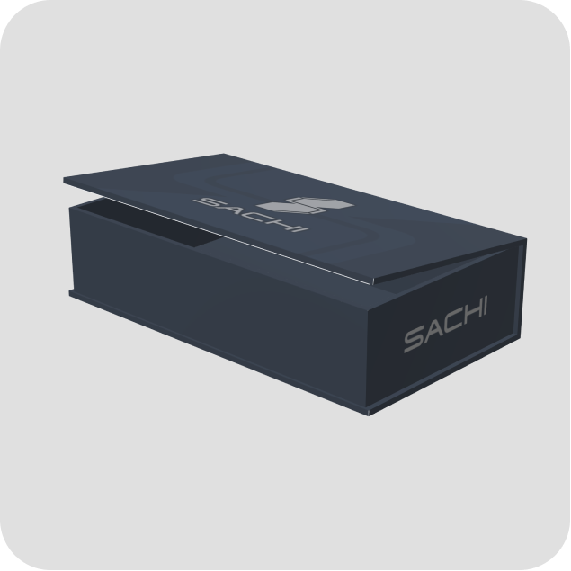
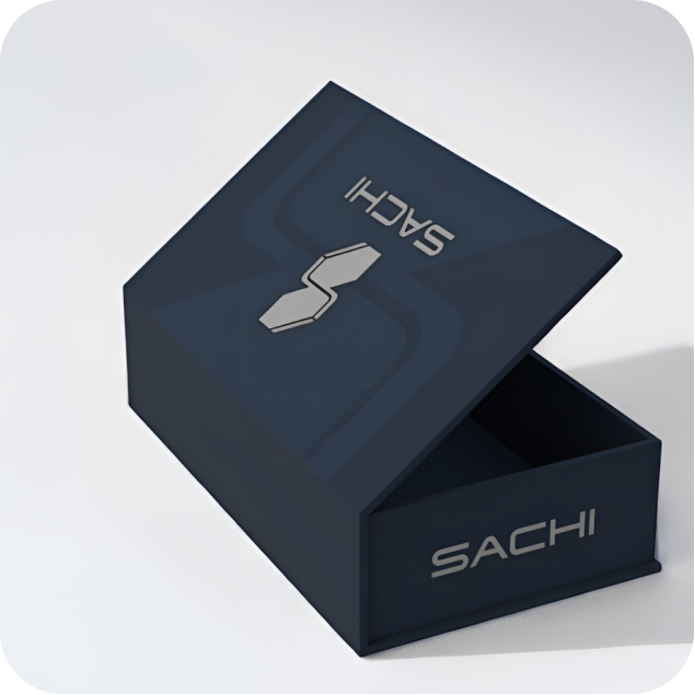
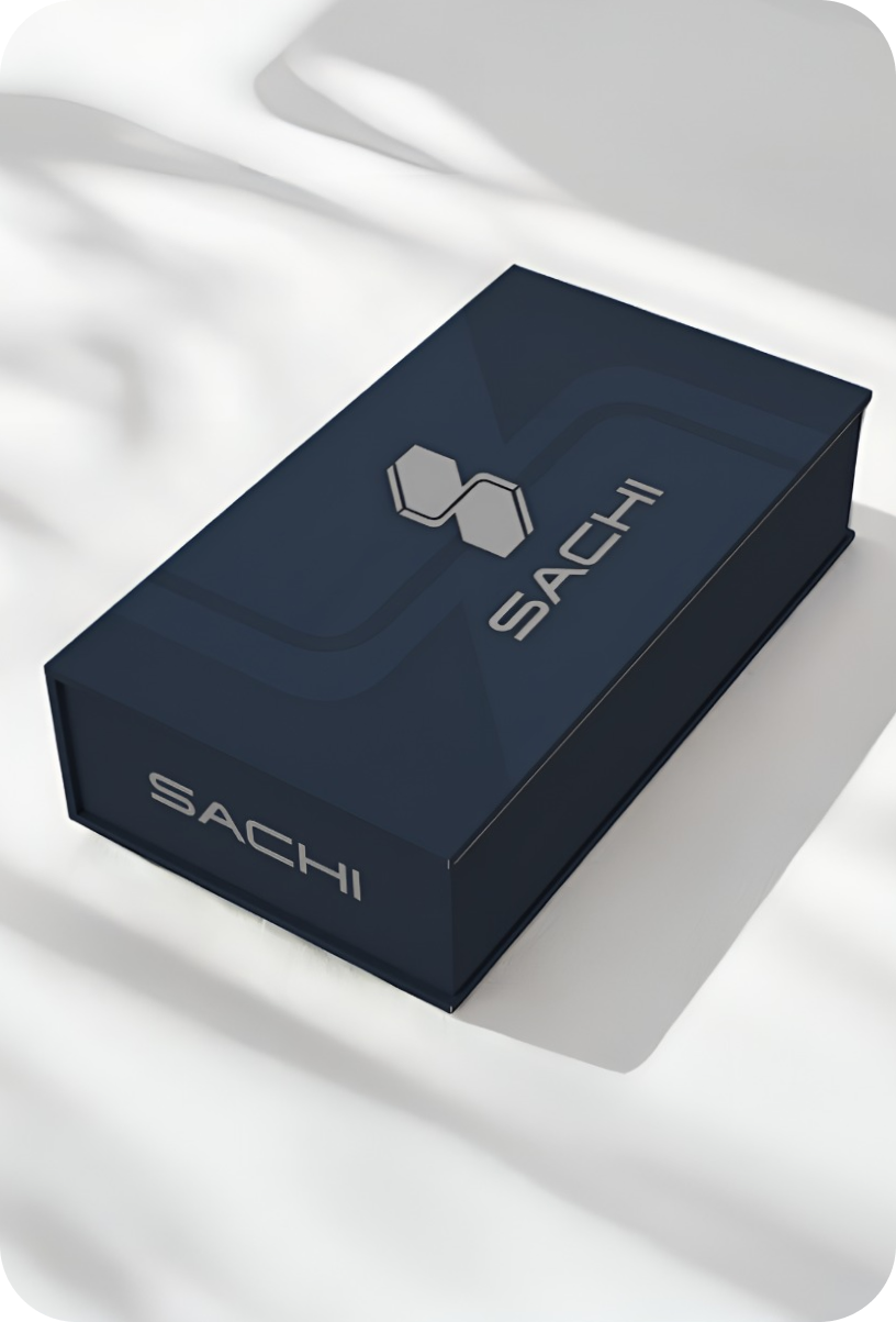
IDENTITY CREATION
The new visual identity draws inspiration from engineering precision and architectural strength — representing the synergy between steel and concrete. The logo system and design language convey stability, innovation, and care, while maintaining distinct recognition for both Sachi Steel and Sachi Precast. The identity encapsulates the idea of “Strength with Care” — a philosophy rooted in reliability and responsibility across every product and project.

tone of voice
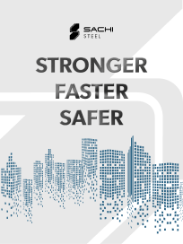
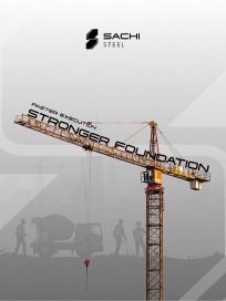
This tagline captures Sachi Group’s core promise — strength built with responsibility, precision, and human value. The tone of voice is assured yet approachable, reflecting the Group’s belief in engineering quality while caring for people, projects, and progress.
Social media feed design
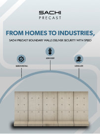
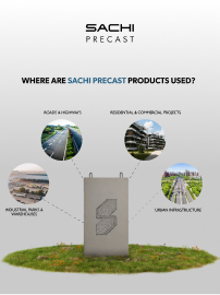
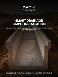
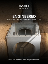
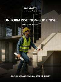
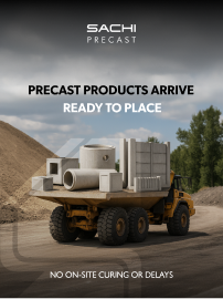
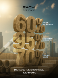
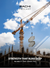
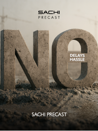
For Sachi Precast, the objective was to educate and inspire. We developed a social media strategy that highlighted the brand’s product diversity, on-site advantages, and time-saving technology. The visuals and copy focused on ease, reliability, and performance, helping customers and contractors understand how Sachi Precast brings efficiency and quality to modern infrastructure. This consistency turned the feed into an information-driven yet aspirational space for builders and engineers alike.
Social media feed design
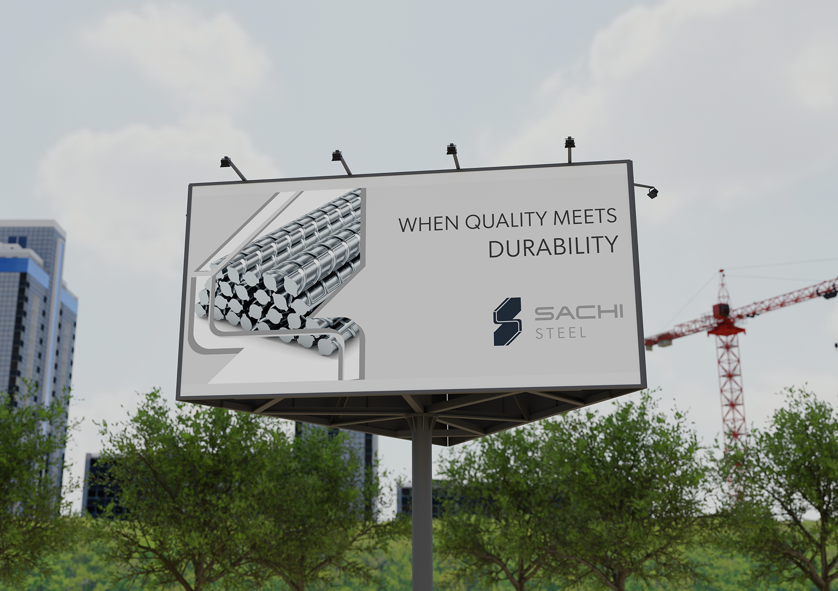
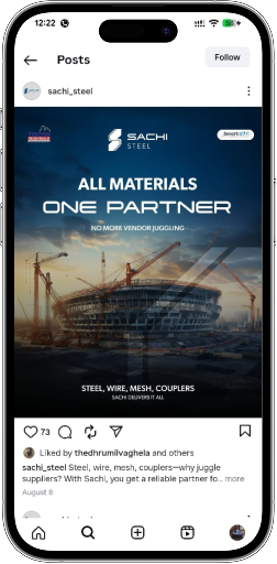
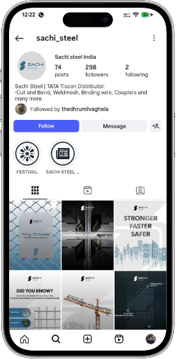
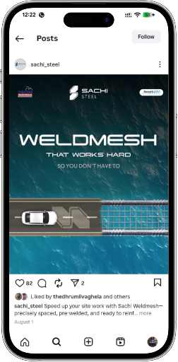
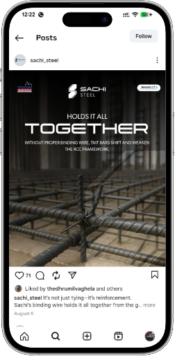
Once the brand identity and messaging were finalized, we began by reshaping Sachi Steel’s social media presence. Our focus was on modernizing the visual tone, creating a content system that reflected the brand’s industrial precision, strength, and innovation. Every creative now communicates a unified story — from product awareness and dealer engagement to technology-led manufacturing — strengthening recall and trust within the construction community.
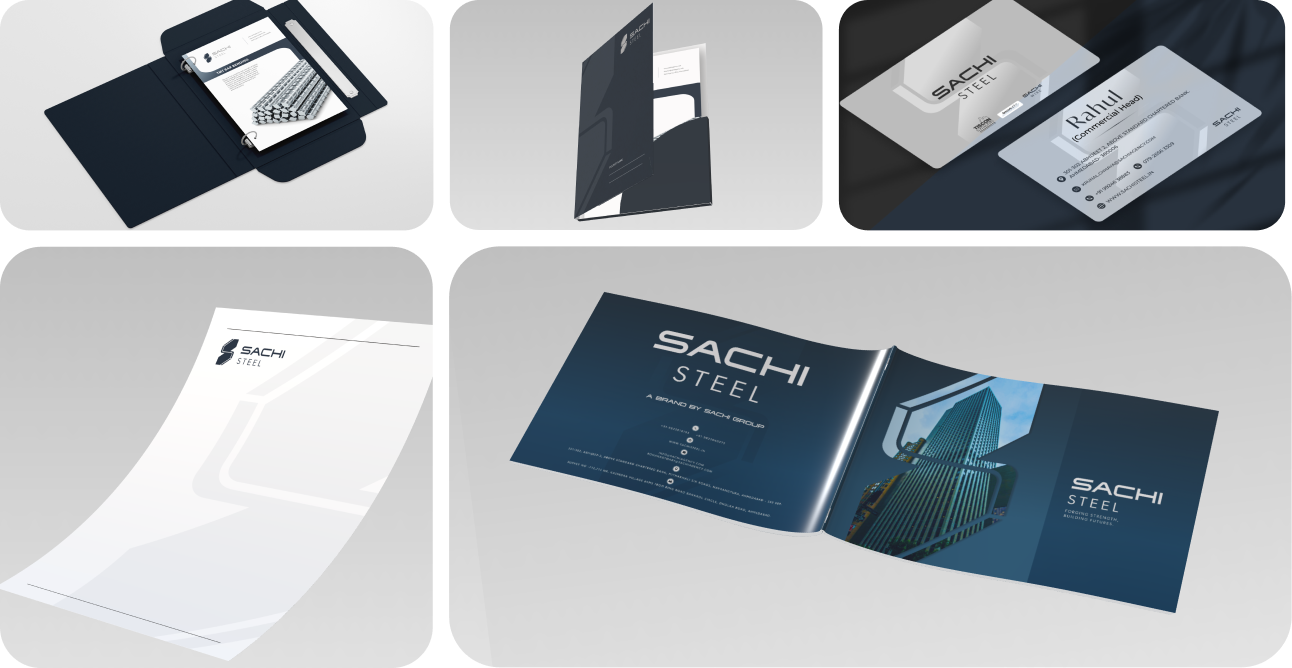
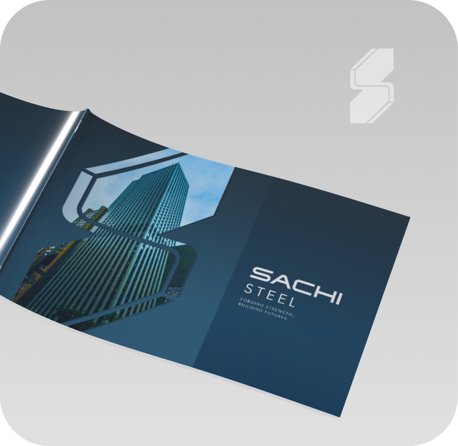
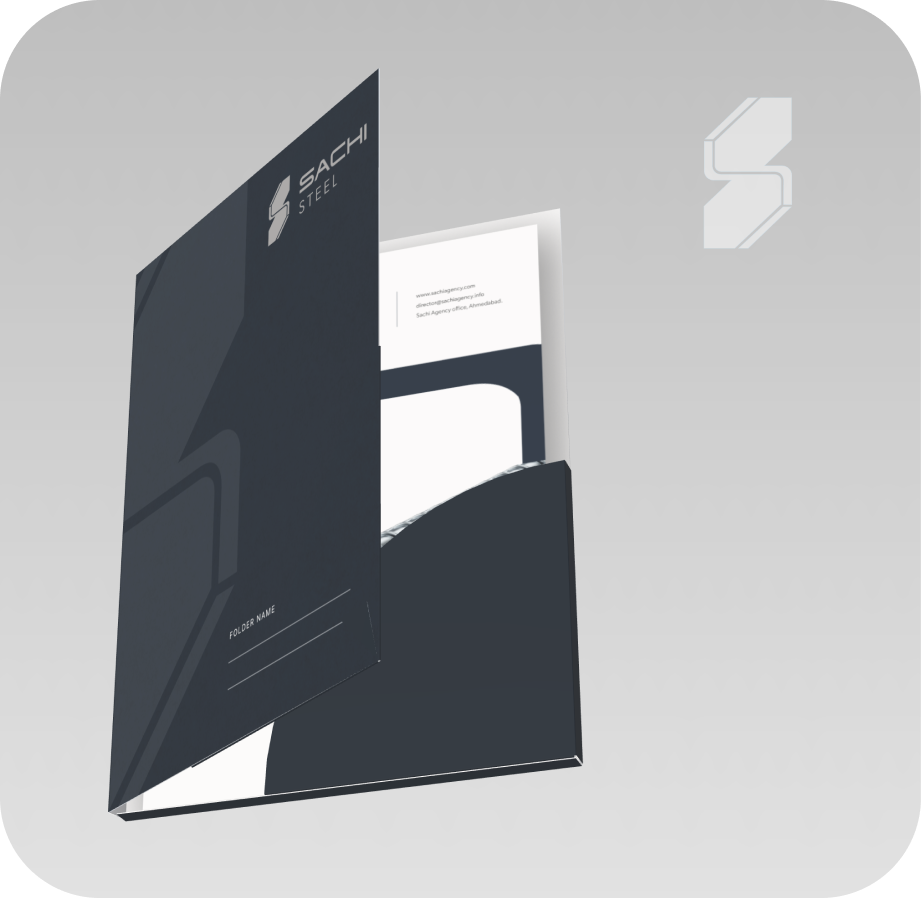
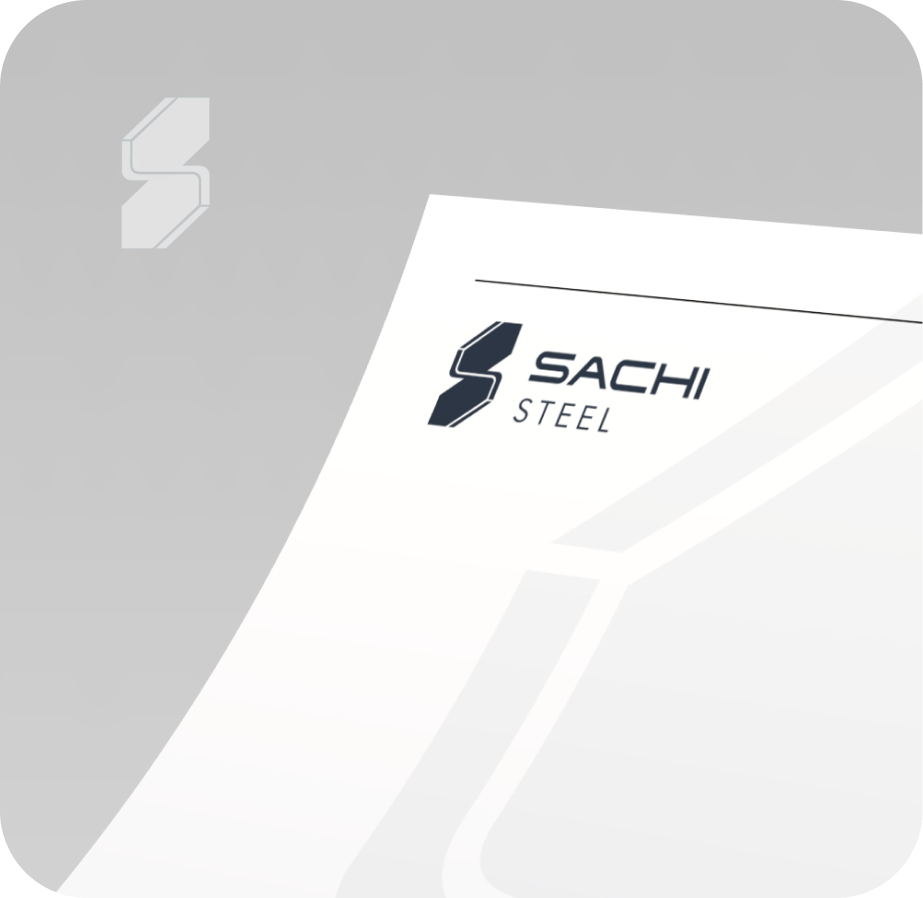
The second most important touchpoint for the brand was all their collaterals design. Right from their brochures, cards to their diaries and dealer collaterals were designed by hypace studios
stall design
For Sachi Group, festive gifting is more than a gesture — it’s a way to strengthen relationships with dealers, clients, and partners. We conceptualized and designed exclusive Diwali hampers, blending premium aesthetics with brand symbolism. Each hamper reflected Sachi’s core values of strength, care, and reliability, turning festive gifting into a thoughtful expression of gratitude and goodwill.
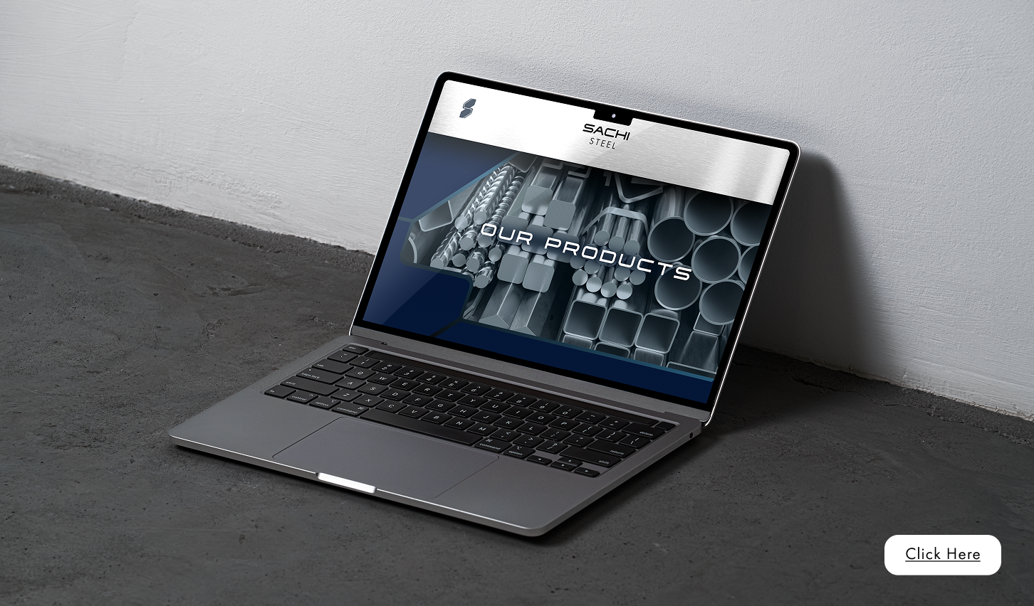
The Sachi Steel website was built to express innovation and modernity through design. We combined clean visuals, precise product categorization, and a confident tone to create a digital showroom for engineers, dealers, and construction partners. The platform balances technical clarity with brand emotion, ensuring every visitor experiences the brand’s strength, trust, and forward-thinking mindset.
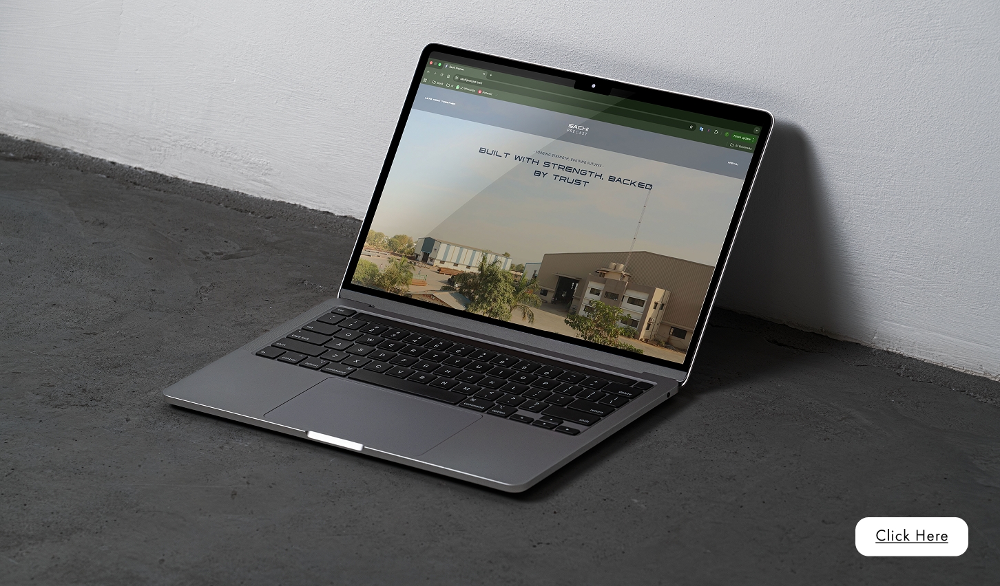
The Sachi Precast website was structured to position the brand as a leader in precast technology. We developed a seamless, content-rich experience showcasing product details, manufacturing processes, and project applications.Minimal design, balanced visuals, and crisp typography helped reinforce Sachi Precast’s image as reliable, efficient, and future-ready. Together, the two websites established a unified digital identity for the Sachi Group.
Breakdown
Significant improvement in brand recall and perception consistency across the Gujarat construction sector.Unified presence of Sachi Steel and Sachi Precast leading to stronger group recognition and long-term brand equity

Increase in social media engagement
dealer participation in brand-led initiatives
"Working with Hypace Studios has been a smooth and impactful experience. Their understanding of branding, design, and digital strategy helped us elevate our presence across platforms. From creative execution to timely delivery, their team maintained high standards of quality and professionalism. We truly appreciate their proactive approach and attention to detail, and we look forward to continuing this collaboration"

2313 W Sam Houston Pkwy N, Houston, TX 77043, USA
F-90/10, Pocket F, Okhla Phase I, Okhla Industrial Estate, New Delhi, Delhi 110020
Here's where you can find us :
+91 97378 33335
503, Shilp Zaveri, Shyamal Cross Rd, near Iconic Shyamal, Ahmedabad, Gujarat 380015


.svg)
Social Media Revamp - Sachi Precast